Welcome to the Litos theme configuration guide. All essential settings for your website are managed through the src/config.ts file. This comprehensive guide will walk you through each configuration section to help you customize your site effectively.
Core Site Configurationh2
The SITE object contains fundamental settings that define your website’s identity and metadata:
export const SITE: Site = { title: 'Litos', // Your website title description: 'Litos is a blog theme built with Astro.js and Dnzzk2.', // Site description website: 'https://litos.vercel.app/', // Your website URL base: '/', // Base URL path (change if not deployed at root) author: 'Dnzzk2', // Author name ogImage: '/og-image.jpg', // Default Open Graph image for social sharing}Here’s a detailed explanation of each configuration property:
| Property | Description | Details |
|---|---|---|
| title | Website Title | Displayed in browser tabs and search results, crucial for SEO and brand identity |
| description | Site Overview | Shown in search results and social media shares, should include keywords for SEO optimization |
| website | Production URL | Used for generating canonical links and ensuring proper URL resolution |
| base | Base Path | Keep as ’/’ when deployed at root, or set subdirectory (e.g., ‘/blog/‘) |
| author | Author Name | Used in meta tags and attribution information |
| ogImage | Default Social Media Preview Image | Image displayed when shared on social platforms (recommended size: 1200×630px) |
Navigation Structureh2
Litos provides a dual-navigation system to enhance user experience and site accessibility. The navigation is split into two main components: header navigation (HEADER_LINKS) for primary routes and footer navigation (FOOTER_LINKS) for comprehensive site mapping.
Header Navigationh3
The header navigation contains your most important and frequently accessed pages:
export const HEADER_LINKS: Link[] = [ { name: 'Posts', // Display text in navigation url: '/posts', // Route path }, { name: 'Projects', url: '/projects', },]Footer Navigationh3
The footer navigation provides a complete sitemap and additional important links:
export const FOOTER_LINKS: Link[] = [ { name: 'Readme', url: '/', }, { name: 'Posts', url: '/posts', }, { name: 'Projects', url: '/projects', }, { name: 'Tags', url: '/tags', },]Navigation Configuration Guideh3
Navigation Link Configuration Details:
| Property | Description | Usage |
|---|---|---|
| name | Display Text | The text shown in the navigation menu |
| url | Target Path | Must start with ’/’ for the target page path |
- Header Navigation: Focus on primary content sections
- Footer Navigation: Include secondary pages and site resources
- Path Settings: All paths are relative to the site root
- Link Consistency: Ensure consistency between header and footer navigation links
Social Media Integrationh2
Litos includes a built-in social media integration feature that allows you to showcase your social media presence. The social links appear in a designated area of your site:
Configure your social media links in the src/config.ts file:
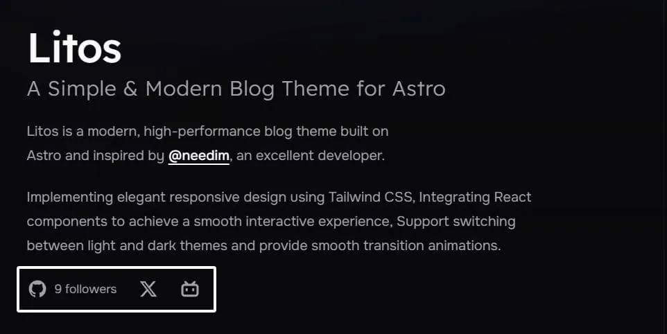
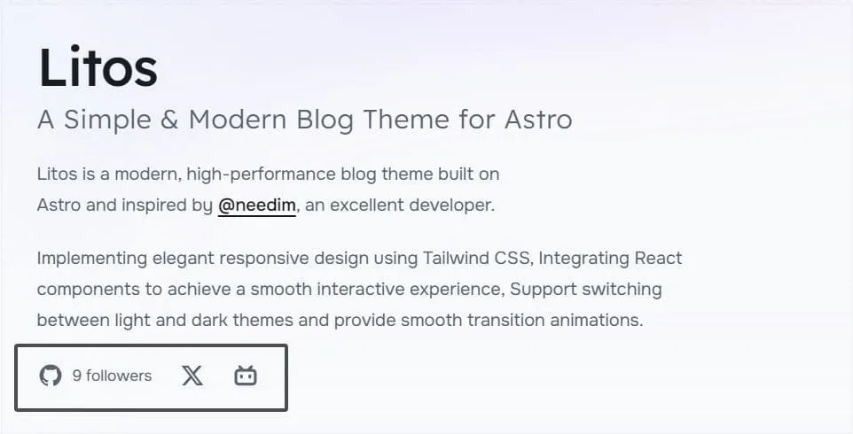
export const SOCIAL_LINKS: SocialLink[] = [ { name: 'github', // Platform identifier url: 'https://github.com/yourname', // Your profile URL icon: 'icon-[ri--github-fill]', // Iconify icon class count: 9, // Optional: follower count }, { name: 'twitter', url: 'https://x.com/yourname', icon: 'icon-[ri--twitter-x-fill]', }, { name: 'bilibili', url: 'https://space.bilibili.com/yourSpaceId', icon: 'icon-[ri--bilibili-fill]', },]Each social link object supports the following properties:
| Property | Description | Details |
|---|---|---|
| name | Platform Identifier | Used for internal reference and accessibility |
| url | Profile URL | Direct link to your profile page on the platform |
| icon | Icon Class Name | Icon class from Iconify, customizable through Tailwind CSS |
| count (optional) | Follower Count | Optional, displays follower count; automatically updates GitHub followers when GitHub integration is enabled |
- Browse and select your preferred social media icons from Iconify
- Maintain consistent icon styles across all social links
- Enable GitHub integration for automatic follower count updates
- Test social links visibility in both light and dark theme modes
Github configurationh2
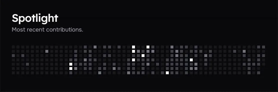
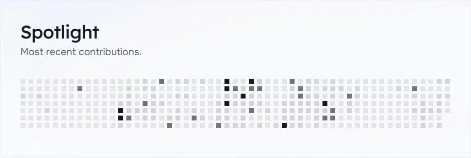
When you visit the homepage, you’ll notice the GitHub data display area (Spotlight) as shown in the image. This feature can be enabled through the following configuration.
Configuration Detailsh3
Configure GitHub-related features in the src/config.ts file:
export const GITHUB_CONFIG: GithubConfig = { ENABLED: true, GITHUB_USERNAME: 'Dnzzk2', TOOLTIP_ENABLED: true,}Configuration options explained:
| Property | Description | Details |
|---|---|---|
| ENABLED | Enable GitHub Features | Type: boolean, Default: true. When enabled, displays Spotlight and automatically updates GitHub follower count in Social Links |
| GITHUB_USERNAME | GitHub Username | Type: string, Username to retrieve data |
| TOOLTIP_ENABLED | Whether to enable tooltip | Type: boolean, Default: true. When the mouse hovers, the specific contribution value is displayed |
This feature has been moved from a build request to a client request, using the API provided by github-contributions-api. Many thanks to them for opening up.
Skills Configurationh2
The Skill module is configured via SKILLSSHOWCASE_CONFIG in config.ts.
export const SKILLSSHOWCASE_CONFIG: SkillsShowcaseConfig = { SKILLS_ENABLED: true, SKILLS_DATA: [ { direction: 'left', skills: [ { name: 'JavaScript', icon: 'icon-[mdi--language-javascript]', }, { name: 'CSS', icon: 'icon-[mdi--language-css3]', }, { name: 'HTML', icon: 'icon-[mdi--language-html5]', }, { name: 'TypeScript', icon: 'icon-[mdi--language-typescript]', }, ], }, { direction: 'right', skills: [ { name: 'Astro', icon: 'icon-[lineicons--astro]', }, { name: 'Node.js', icon: 'icon-[mdi--nodejs]', }, { name: 'React', icon: 'icon-[mdi--react]', }, { name: 'Next.js', icon: 'icon-[devicon--nextjs]', }, { name: 'Tailwind CSS', icon: 'icon-[mdi--tailwind]', }, { name: 'Iconify', icon: 'icon-[line-md--iconify2-static]', }, ], }, ],}The following is a detailed explanation of the various properties in the SKILLSSHOWCASE_CONFIG configuration object:
| Property | Description | Details |
|---|---|---|
| SKILLS_ENABLED | Whether to enable the skill display function | Set to true to enable the skill display module, set to false to disable |
| SKILLS_DATA | Skill display data array | Contains multiple skill groups, each group can have different directions and skill lists |
| direction | Skill group display direction | Optional values: left or right, determines the animation direction of the skill group on the page |
| skills | Skill list | All skill items under this direction group |
| name | Skill name | Displayed skill name text |
| icon | Skill icon | Icon in Iconify format, available from Iconify Icon Set get |
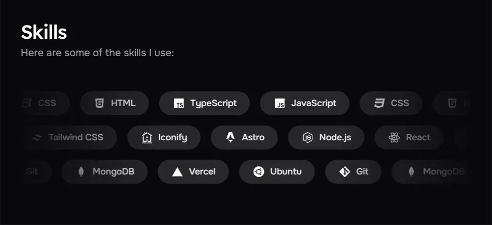
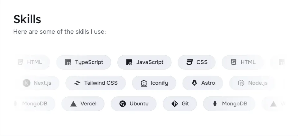
The skill display module allows you to showcase your technology stack and professional skills on your personal homepage. With the direction property, you can create skill groups with alternating directions to make the page more dynamic and visually appealing. Each skill item contains a name and an icon. The icon is integrated using Iconify, providing thousands of optional icons.
You can add as many skill groups as you want, and each group can contain as many skills as you want. For example, you can organize skills by technology category (front-end, back-end, tools, etc.) or proficiency level.
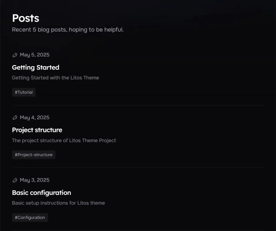
Posts Configurationh2
Litos provides comprehensive configuration options for blog posts through the POSTS_CONFIG object in src/config.ts. This section covers post display settings, pagination, and layout options.
export const POSTS_CONFIG: PostConfig = { title: 'Posts', description: 'Posts by Dnzzk2', introduce: 'Here, I will share the usage instructions for this theme to help you quickly use it.', author: 'Dnzzk2', homePageConfig: { size: 5, type: 'compact', }, postPageConfig: { size: 10, type: 'image', }, tagsPageConfig: { size: 10, type: 'time-line', }, cover: '/og-image.jpg', postType: 'horizontal', imageDarkenInDark: true, readMoreText: 'Read more', prevPageText: 'Previous', nextPageText: 'Next', tocText: 'Catalogue', backToPostsText: 'Back to Posts', nextPostText: 'Next Post', prevPostText: 'Previous Post',}The following is a detailed explanation of the various properties in the POSTS_CONFIG configuration object:
| Property | Description | Details |
|---|---|---|
| title | Posts Page Title | Displayed in the browser tab and search results |
| description | Posts Page Description | Used for SEO |
| introduce | Posts Page Introduce | Introduce below the page title |
| author | Posts Author | Used in meta tags and attribution information |
| homePageConfig | Homepage Post Display Settings | Configures the display of posts on the homepage |
| size | Number of Posts per Page | The upper limit of displayed posts |
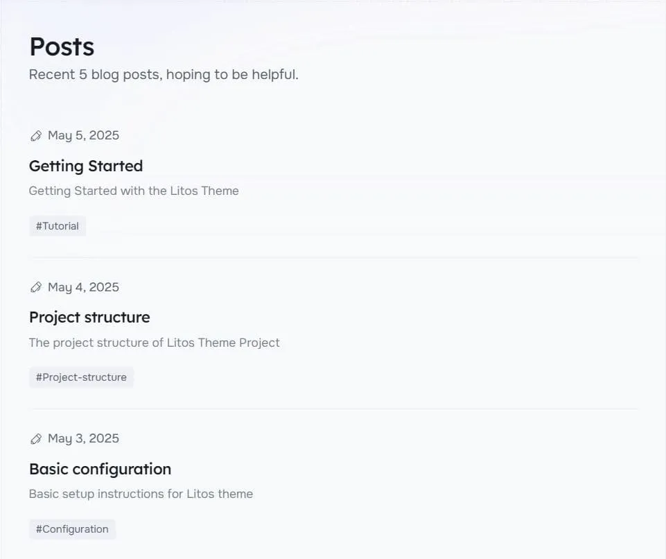
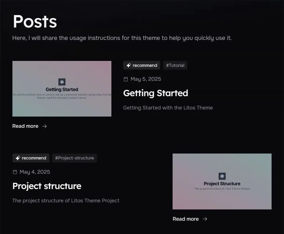
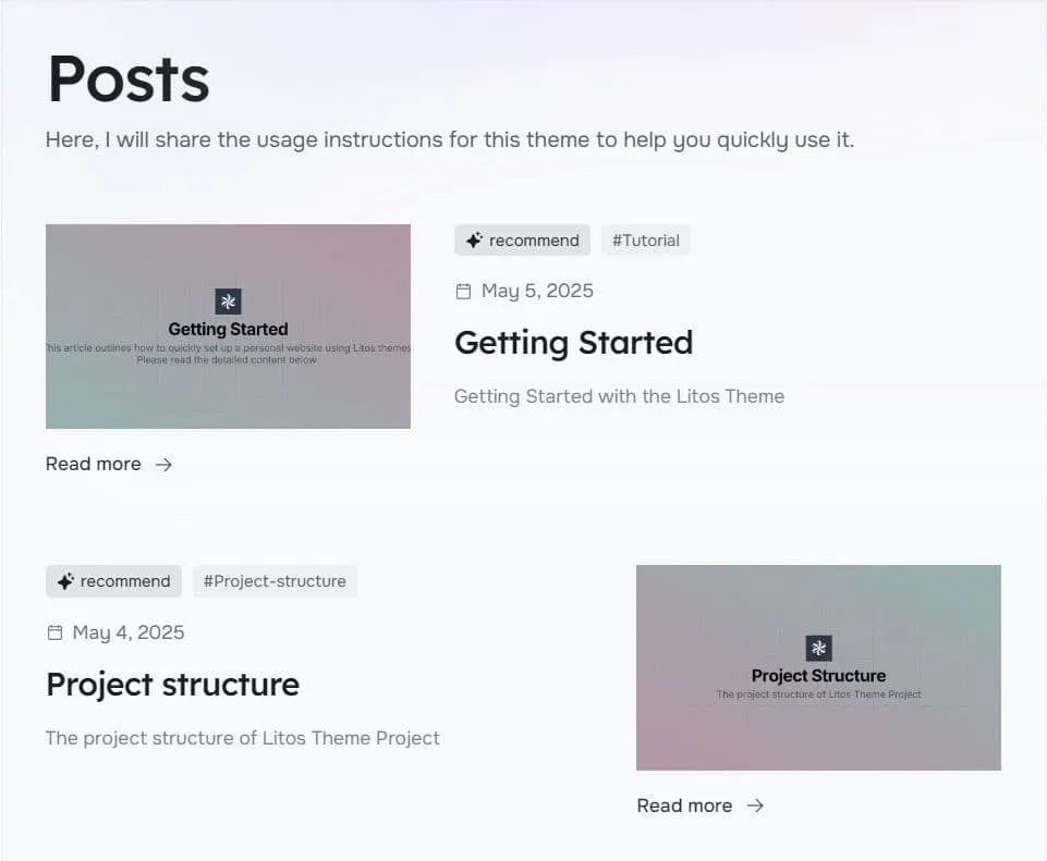
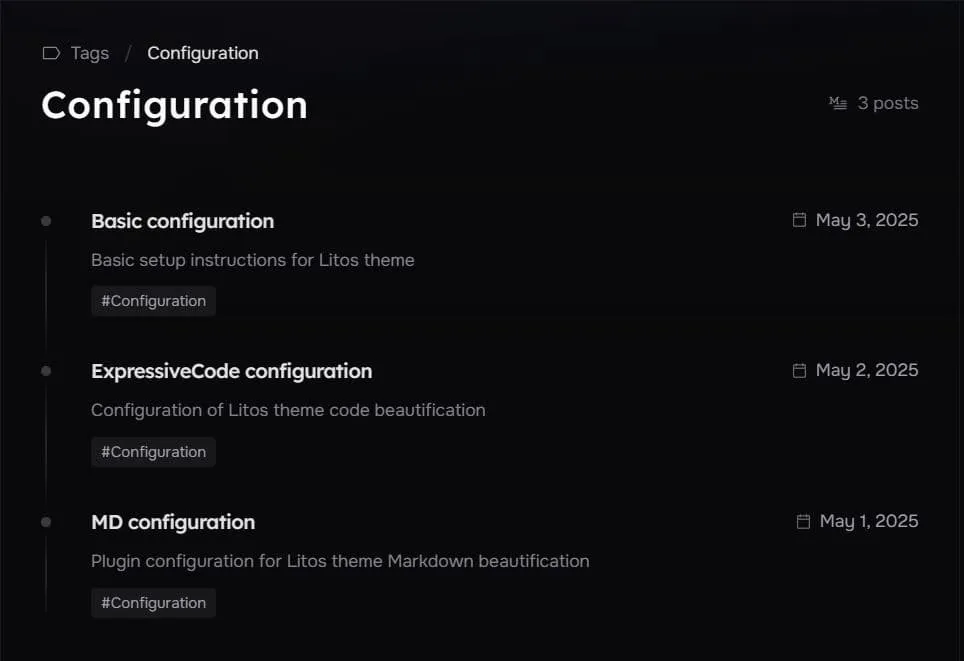
| type | Post Display Type | The card types displayed in the post list: compact、image、time-line |
| coverLayout | Position of the image | The position of the image in the card: left、right. When the type is an image, it can be used. The default is one left and one right. This attribute can be used to force changes, but its priority is not as high as the frontmatter inside MD |
| postPageConfig | Individual Post Display Settings | Configures the display of individual posts |
| size | Number of Posts per Page | The number of pages in pagination |
| type | Post Display Type | The card types displayed in the post list: compact、image、time-line |
| coverLayout | Position of the image | The position of the image in the card: left、right. When the type is an image, it can be used. The default is one left and one right. This attribute can be used to force changes, but its priority is not as high as the frontmatter inside MD |
| tagsPageConfig | Tags Page Display Settings | Configures the display of posts by tags |
| size | Number of Posts per Page | The number of pages in pagination |
| type | Post Display Type | The card types displayed in the post list: compact、image、time-line |
| coverLayout | Position of the image | The position of the image in the card: left、right. When the type is an image, it can be used. The default is one left and one right. This attribute can be used to force changes, but its priority is not as high as the frontmatter inside MD |
| cover | Default Cover Image | The default cover image displayed in image mode in the post list |
| coverAspectRatio | Default Cover Image Aspect Ratio | The aspect ratio of the default cover image |
| postType | Default style for metadata at the top of the article | Customize the display style of meta information at the top of the article |
| imageDarkenInDark | Darken Cover Image in Dark Mode | Whether to darken the cover image in dark mode |
| readMoreText | Read More Text | The text content of “Read More” under the picture card |
| prevPageText | Previous Page Text | The text displayed on the previous page button |
| nextPageText | Next Page Text | The text displayed on the next page button |
| tocText | Table of Contents Text | The text displayed in the table of contents |
| backToPostsText | Back to Posts Text | The text displayed on the back to posts button |
| nextPostText | Next Post Text | The text displayed on the next post button |
| prevPostText | Previous Post Text | The text displayed on the previous post button |
There are three places in this theme that display the Post list, so three properties are used to configure them.
There are three places in this theme that display the Post list, so three properties are used to configure them. They are homePageConfig, postPageConfig, and tagsPageConfig. Matching the homepage, post page, and detailed tag page respectively.
In order to maintain the richness of the page style, I have set three values for the type attribute under these three attributes, corresponding to three post cards, which are: compact、image、time-line.
Configure the style you think is suitable on three pages, and of course, you can also create your own card style by creating your card file in src/components/posts/card and importing it to List.astro in the same directory for configuration.
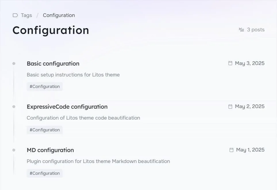
Tags Configurationh2
Tags Configuration only provides two basic configuration properties:
export const TAGS_CONFIG: TagsConfig = { title: 'Tags', description: 'Tags by Dnzzk2', introduce: 'All the tags for posts are here, you can click to filter them.',}| Property | Description | Details |
|---|---|---|
| title | Tags Page Title | Displayed in the browser tab and search results |
| description | Tags Page Description | Used for SEO |
| introduce | Tags Page Introduce | Introduce below the page title |
Projects Configurationh2
Projects Configuration only provides two basic configurations:
export const PROJECTS_CONFIG: ProjectsConfig = { title: 'Projects', description: 'Projects by Dnzzk2', introduce: 'The examples of my projects.',}In addition, it also provides configuration for ProjectList.
export const ProjectList: Project[] = [ { name: 'Litos', description: 'A blog theme built with Astro.js and Dnzzk2.', githubUrl: 'https://github.com/Dnzzk2/Litos', website: 'https://litos.vercel.app/', type: 'icon', icon: 'icon-[ri--github-fill]', star: 1, }, { name: 'Litos', description: 'A blog theme built with Astro.js and Dnzzk2.', githubUrl: 'https://github.com/Dnzzk2/Litos', website: 'https://litos.vercel.app/', type: 'image', icon: '/projects/logo.png', star: 1, },]| Property | Description | Details |
|---|---|---|
| name | Project Name | Project name |
| description | Project Description | Project description |
| introduce | Project Page Introduce | Introduce below the page title |
| githubUrl (optional) | Project GitHub URL | Project github address |
| website (optional) | Project Website URL | Project URL |
| type | Project Type | Used for displaying the project type: icon、image |
| icon | Project Icon | When the type is icon, use iconify to display the icon. When it is image, use it for the image address. Put the image address in public/projects |
| imageClass (optional) | Project Image Class | When type is an image, it is used to modify the image |
| star (optional) | Project Star | Number of stars |
| fork (optional) | Project Fork | Number of fork |